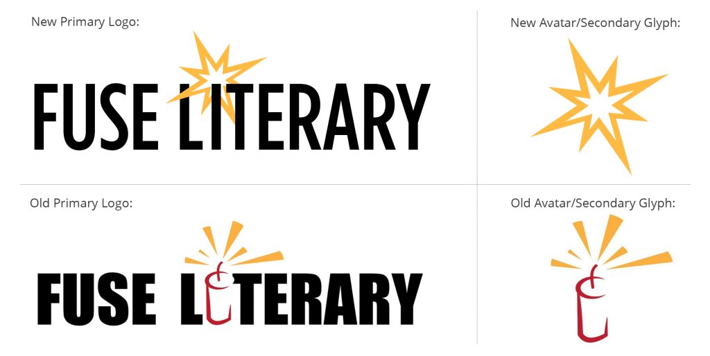
When we set out to update the Fuse Literary logo and branding, we started by going through our existing brand identity assets to get a better sense of what we’d want to move away from and where we’d like to go. Understanding Fuse’s history, its growth over the past eight years, and its goals as an agency helped to establish purposeful intent for each design choice in order to create a strong, cohesive brand image.

We knew we wanted to aim for an identity that was clean and timeless but also bold and forward, while maintaining a thread of continuity between the old identity and the new. Something recognizable and reminiscent of Fuse’s past with an eye toward the future.
The concept that kept rising to the top was the updated spark over the capital “I”. With the “I” in the text standing in for a distinct dynamite element, this concept maintained the feel of the old logo but brought it forward in a clean, fresh way.
Updating the style of the spark, itself, was also important. Forgoing the original spark design with its six individual triangles in favor of an outlined eight-pointed star—with a point for each of Fuse’s first eight years as an agency—seemed like the perfect nod to the past, not only to its old logo, but to the journey Fuse has taken from inception to the present day. The star’s points are also staggered in length, reminiscent of the points on a nautical compass, evoking a sense of maintaining a steady course along a path toward the future.

As far as the color palette, keeping it consistent with the original was key to maintaining continuity and sustaining Fuse’s brand recognition. Choosing to go with a two-color option instead of the original three allowed the singular spark glyph to really shine through over the black text while maintaining optimal legibility.
Overall, we’re proud of the way the Fuse redesign turned out. We hope over time it’ll settle in and become something not only as memorable as our original logo, but also meaningful and representative of who Fuse is as an agency.
As Tom Geismar—designer of some of the most recognizable logos on the planet—once said: “Logos are funny things. At first they are just designs on paper. Eventually they come to embody all the qualities of the organization they represent, and most people cannot separate the ‘design’ from their full range of opinions about the organization. The hard task the designer faces is trying to help the client see how the logo might eventually be perceived, how it will work for them, not just whether they ‘like it’.”
But whether or not our new look will set Fuse apart from the industry, we know it’s our agents themselves and their dedication, experience, and ever-expanding group of amazing clients who exemplify what Fuse stands for more than a logo ever could.


